![]()
If you are one of those who still think “Branding” is all about visual elements, you should think again. If you think that a “Logo” is just a meaningless design done arbitrarily, then you need to read this article, in which we are exploring the depths of the art of branding, branding and logo relationship, diving deep into ãrtimedia Pro’s logo concept specifically. So let’s get started!
The Art of Branding: Crafting a Strong Connection with Consumers
In today’s consumer society, that’s full of countless products and services, it too hard for any startup company to prove itself in the market. Here comes the crucial need of sharing the brand values with clients and building trusting bridges with them. In other words, here starts the competition of grabbing a consumer’s attention, trust, and loyalty afterwards. This competition’s main weapon is “Branding”. Many points about the art of branding and the importance of branding are explained in the next few lines.
The Art of Branding:
Branding is a marketing practice that focuses on making the brand memorable. It helps consumers differentiate your business’ products or service from others. Thus, we could say that branding is a comprehensive process that revolves around creating a strong relationship with consumers through basic elements such as a logo, tagline, mission statement, design, and communications. All these elements unify, giving your customer a memorable experience.
The Importance of Branding: Building Trust and Loyalty
If we may assume, advertising without an effective brand strategy is an imperfect marketing process, as branding is the very thing that gives your audience a clear sense of purpose, direction, and a credible and trustworthy voice they want to listen to. To sum it up, Branding has a main role in creating an emotional connection with consumers, boosting conversions, giving a business a definitive meaning, and helping create a brand’s loyalists.
- a- Creating an emotional connection with consumers: Numbers show that 64% of women and 68% of men have felt an emotional connection with a brand. This means that strong branding provokes emotions such as interest, trust, and optimism, which are the top three feelings people experience in relation to the brands they prefer. Moreover, emotions are a powerful energy, influencing a consumer’s behavior and choices.
- b-Boosting conversions: Increased conversions rates are related to a business’ brand strategy, as reputed brands can persuade potential customers to buy their products and services. In this respect, Forbes revealed that presenting a brand consistently across all platforms increases revenue by up to 23%.
- c- Giving a business a definitive meaning: Against today’s advertisements flood, your business message/meaning is what helps your brand stand out. If to say, you must win your customer’s mind and heart along with money. That’s all the matter!
- d- Helping create a brand’s loyalists: Never belittle the power of your brand’s loyalists. Statistics reveal that 94% of loyal customers are likely to recommend a brand they were emotionally engaged with. So start by establishing a positive emotional connection and end in creating more effective loyalists. This would level revenues up.
Logo and Branding: The Key Elements for Effective Brand Strategy
Let’s agree that a “Logo” is the cherry on top of any brand strategy. It remains an empty design or abstract shape or image until it gains its meaning through how far or close it is to the brand values and message. That’s why many companies have changed their logos partially or totally throughout their long history. They all wanted to perfect their effective branding strategy, trying to reach the perfect logo, which must be simple, different, relevant, memorable, and professional.
Keeping It Simple: Importance of Simplicity in Logo Design
Any logo must be simple to achieve its role, which is identification. When we see a logo, we must know “who” not “what” and it should contain one idea; this means it should contain what is needed only. In short, a logo must enable us to identify the brand by a glance. Moreover, hundreds of companies have changed their logos, replacing them with more simplified ones. This would be clear if you take a look at the most famous logos in the world.
Standing Out: Creating a Unique and Differentiated Logo
Over 1.5 million significant brands in the world are fighting every day to win your attention as a customer. Here comes the role of branding. It helps you separate a brand from the other and choose which the one to trust. The unique and different logo is a key part of that because the worst thing is to have a logo that will make a confusion with another competing brand. We understood that accurately while creating ãrtimedia Pro’s logo.
Staying Relevant: Connecting the Logo to the Industry
Different, yet relevant! This is the golden advice. In other words, a clear line must connect the logo to the industry it represents. Colors, fonts, and shapes can tell everything about the brand. We all collectively agree that that certain shapes, colors and objects are used in conjunction certain industries and business. So let’s say that going too far from the common expectations will cause loss of trust.
Creating a Lasting Impression: Making the Logo Memorable
Make a logo that makes an impact! Shapes and colors deliver endless yet specific messages. Statistics show that colors are the first thing you notice in a logo, what gets fastest to our brains, then comes the logo’s shape, icons, or typography.
Professionalism Matters: Executing a Perfect Logo Design
A successful logo is one that’s well executed. Imperfect curves and shapes, or inconsistent spacing, poor color choice, and many other imperfections must be avoided to get a professional and perfect logo.
![]()
Unveiling the Concept: artimedia Pro’s Logo Design
It took a long time, research, and hard work until finally we could innovate our unique logo that tells a lot about our business. Simplicity, differentiation, relevancy, memorability, and professionalism are key features on which we keep our eyes while creating the logo. It’s not arbitrary designs, colors, and shapes. But, it’s a comprehensive concept that delivers our business message, vision, and values . Getting them in detail: artimedia Pro’s name concept, meaning of logo, and visual identity.
- artimedia Pro’s Name Concept: Consisting of three main parts, ãrtimedia Pro embodied the perfect combination of Art as a core value + Media as the field of influence + Pro as a team of professional experts aiming at making a sparkling effect in the world of digital marketing.
- Meaning of Logo: Taking the “A” as the logo has a high significance shown in the choice of: Letter A, Gold color, and fonts and shapes.
The Power of “A”: Symbolism and Significance in the Logo
It’s the first alphabetical letter, with which our team started creating a unique impact in the world digital market. It’s the pure embodiment of the “Beginning” concept, beginning of a success story, beginning of a path to untrodden heights, and beginning of a journey of a passionate team of professional compromising members, who always seek perfection. Also it’s a clear expression of a systematic approach that we apply with every new strategy for our clients. It’s a successful approach that starts where it must from the right beginning and brings the right results.
The Golden Touch: Exploring the Use of Gold Color
Why Gold? It’s the luxury color. Prestigious color that’s related to the high value and rank, reflecting much of wisdom and beauty, especially when unified with White in “artimedia” word. It form a brilliant scenery of a white board waiting a brush of creativity to highlight its perfection and unleash its potentials.
Shape and Typography: Conveying Meaning through Design
Curved lines show fluidity in work and diplomacy as a mindset for our team members. Sharp angles express. the seriousness and commitment to time and quality as core values for artimedia Pro. Whereas the external framework of the letter A, reflects a main feature in our work, which is the ability to contain, understand, and meet the different needs and requirements of the daily and strategic steps of work.
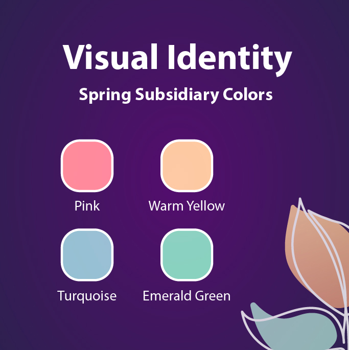
Visual Identity: Spring Colors and Creativity in Branding
When it comes to artimedia Pro’s visual identity, spring subsidiary colors are the choice we adopted for an exceptional and creative visual identity. The selection of pink, warm yellow, emerald green, and turquoise adds an innovative spirit to the whole idea of spring as a time of renew, recreate, and rebirth, or in other words, the time of creative youth, the best engine of creating and achieving.
In a summary, every line, color, and detail in any logo must be a pure reflection of the brand’s ideas, values, and image. This is what artimedia Pro has realized and worked on to finally could create a notices impact in the digital marketing with a seamless professional logo that’s full of meanings and art at the same time. How about you? Do you aspire to have a special logo and brand strategy to stand out in the market? artimedia Pro is your destination!