![]()
The main concept of visual identity, in general, is to keep the brand alive in people’s minds and in daily life, with little details that boost the brand and link it directly to your feelings.
If you ever look at some brand item, or even a store and had an instant feeling, then we are glad to tell you that this is how much a strong and clear brand identity is.
And that is why when looking at any successful project, you will see a successful brand identity and logo. In all business categories, even with movies and TV series, a clear visual identity will make you even more attached to the show, just like F.R.I.E.N.D.S Series , whether you are a fan of it or not, when you see big letters with red, yellow, and blue dots between them, you will for sure remember the great F.R.I.E.N.D.S Series.
Now; after talking about the importance of visual identity, and before starting our Squid Game visual identity study, let us tell you a little more about shapes’ categories, so we all be on the same page:
The three main shapes’ categories and their meanings:
1. Geometric Shapes:
Do you like lines and corners? If the answer is yes, then you will like those most commonly used shapes, moreover; they are the closest and most familiar to our minds since we start drawing them from our kindergarten times.
Geometric shapes include the famous circle, triangle, square, and their derivatives, now; keep this in mind since the Squid Game visual identity fall in this category.

2. Organic Shapes:
Organic shapes send and receivers the sense of connecting to the mother nature and the environment around us, which will help your brand to be closer and conversant to people, which means that organic shapes are every natural related and angle free shapes, like; leaves, trees, and more than that; spontaneous human-made shapes like paint splatters and watercolor blobs.

3. Abstract Shapes:
Abstract shapes are kind of an illustration of organic forms or objects to present an idea with different unique perspective.
Even that abstract shapes could contain a combination of geometric shapes, organic shapes, or even a mix of them both, but it is the freest shape you can go with to create an out of the box identity.
Abstract shapes are way more used in our days than ever, like in mobile apps icons, and famous logos, such as Apple and Microsoft Windows.

Now; with all the statics talking about shapes’ impact on the visual identity and people decisions, it is important to know all the impacts of those shapes psychologically and use them wisely, and this is for sure apply as well on TV series and the whole business show as we are going to see.

What is Squid Game?
If you have not seen the show yet, here is some information about the crazy and most popular 2021 Netflix production:
- The most popular Southern Korean Show.
- 1 series in more than 90 countries including USA.
- Produced by Netflix.
- The script has been rejected for 10 years by producers till Netflix said YES.
- The creator “Hwan Dong-Hyuk” came up with the idea in 2008 after a personal experience and wrote the script in 2009.
- Staff masks were inspired by the Korean traditional masks “Haehotal”.
- The show’s name originally was “Round Six”.

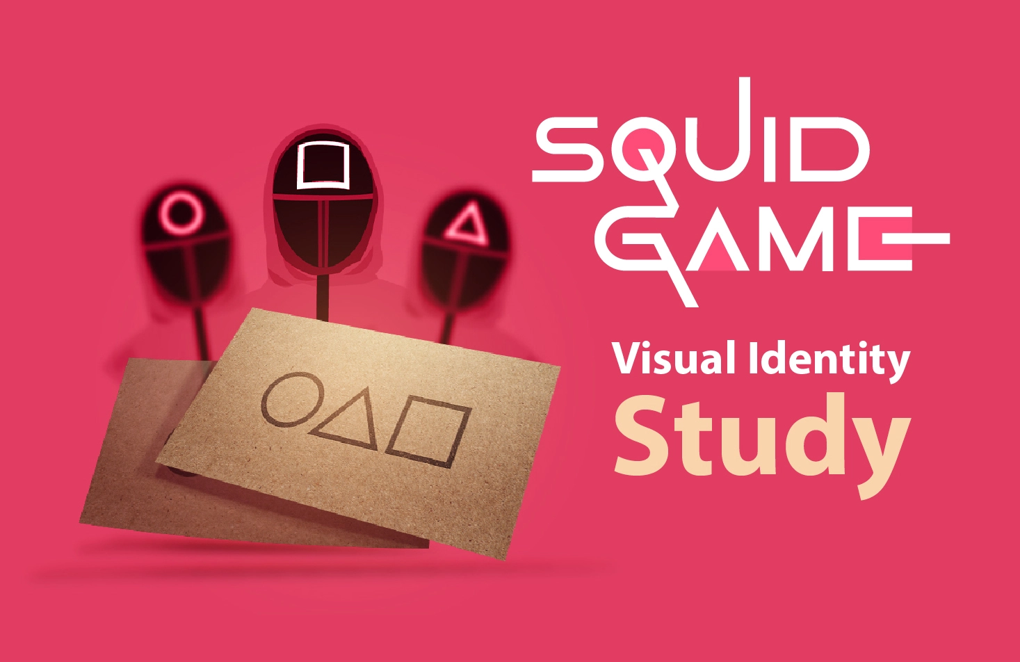
Squid Game Logo and Symbols:
Now; it is time to start talking about the show coming from 2009 Korean visual identity, and YES, it is a charming one, but do you think it is a trend due to all the social platforms winning strategies and that it is a Netflix production, or because it is a really good and well-done show with amazing visuals!
The visual identity and logo shapes in Squid Game Show are all geometric shapes (circle, triangle, and square), but wait a minute, first things first; before starting to analyze each shape, tell us did you start to see the logo shapes in all details, not only in the show, but also; in real life too? Actually an architect friend told me that he was picking up wallpapers with small patterns when he thought that it is all circles, triangles, and squares repeating in rows, so YES; that is how strong the visual identity is in the show.
· The Circle:
While watching the show, you will notice that the circle represents the easy and safe part.
In general, circles represent the sense of complement without sides or corners, which was clear in the show last dinner floor, the half-circle in the start and the end of the glazed bridge in the fifth game, and eventually in the safe squid head in the last game.
On the other hand; workers who are in the lower position had a red circle on their masks, they only had limited responsibility and tasks without any weapons or the permission to talk if not talked to by the supervisor.
So; we can say that circle in Squid Game represents easiness and kind of the safe side.
")
· The Triangle:
The shape in the middle of the Squid Game logo, as the workers who are in the middle stuff ranking, with guns and the authority to shoot contestants who fail in games.
Usually, triangle represents either:
- Religious associations.
- Dynamic approach and power.
- Sense of connectivity.
- The believes in developing and improving.
In Squid Game show we see the three lines shape in all tense, dynamic and powerful situations, like; the table of the last dinner, the shape of connecting beds position of the left three contestants, and finally that triangle masked workers who were like armed soldiers in the game.

· The Square:
While the game inventors say repeatedly that this is a fair and equal game, and since the square shape represents equality, safety, and balance, we notice how the games’ fields are square and the gamers’ dormitory, to give the contestants that feeling.
On the other hand; the effectiveness, efficiency, and problem handling workers with square masks who are the most powerful among workers with the highest authority, and that is a reflection of the square symbol itself.

And that is how we see the game’s logo and visual identity clear in all the details, which helped the show to be a hit and rememberable among people.
Squid Game logo theories:
Even so, there are many theories about the show itself, but when we talk about logo theories, there are four main theories that are worth discussing:

1. Korean Alphabet Theory:
This theory comes from the fact that this show is originally a Korean one, so; it is kind of make sense.
In the Korean alphabet Squid Game means “Ojingeo Geim” and in written Korean, the letter “O” is a circle, the letter “J” has a triangle, and the letter “M” is a square, and together they form “OJM” which are the initials of Korean words of Squid Game.
To make this theory even more sense, this is the same order as in the game card that is handled to invited players.
2. The Actual Squid Game Theory:
This is kind of the strongest theory, due to the high involvement with the main game in the show.
From the first episode, we see kids in the playing field playing Korean Squid Game within the main shapes (circle, triangle, and square) drawn on the floor to shape the game land, and it was also the last game in the show with the same famous shapes.
This theory makes sense, is understandable, and is directly related to the show.


3. PlayStation Theory:
Those three shapes exist on the PlayStation controller, which would be the most popular first look impression on the logo, because of the show game-related name and concept, and the fact that PlayStation is a popular and world-known device.
Even that many experts say that this is a weak theory, but for a lot of viewers it makes sense, and even because of the games in the show, it actually would make the visual identity concept even stronger.
4. Simplicity Theory:
As simple as that ,this theory says that the logo shapes are used from the simple perspective of them being just simple, worldwide known, and related to the fact that all games are simple children’s games, yet with twisted rules.
This is actually the weakest theory among the four of them with no hidden and exciting reasons.
Which theory do you think is the most convincing one? Moreover, do you think the same logo has been used in the other international editions, due to the fact that the VIPs said they enjoyed the Korean edition more than they expected?
Reasons to not forget the Squid Game visual identity:
With a great visual identity from logo design to other details, you will for sure have an unforgettable brand, and build the awareness you are looking for, and here are the reasons why you will remember Squid Game visual identity from our experts’ perspective:
- It is clear, stable, and existed in all the obvious and hidden details.
- It is repeated with cards, characters, spaces, and in strong shapes and colors.
- Shapes are actually simple and existed in our daily life, like: PlayStation, Loona, and even road signs.
- Even the show last dinner accents the three main shapes.
- The winner’s red hair color as the shapes on the masks and workers’ suits color, which insure the visual identity stability.

Finally;
as professionals we at ãrtiMedia Pro ensure you that this is a strong, stable identity with the ability to survive, however; let us all wait to see how long this will survive, and whether or not; there is a second season with the same identity.